
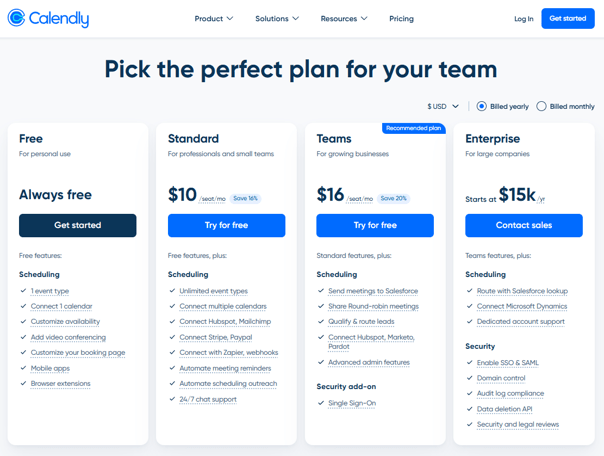
Calendly has 20 million users and no social proof on its pricing page.
That’s a huge opportunity for conversion they’re missing out on.
We built a scoring framework for evaluating SaaS pricing pages. Here’s the breakdown for Calendly:
𝐂𝐚𝐥𝐞𝐧𝐝𝐥𝐲: 𝟗𝟏/𝟏𝟓𝟎 (𝟔𝟏%) – “𝐒𝐭𝐫𝐨𝐧𝐠”
- Strategy & Research – 12/30 (40%)
- Information Architecture – 21/30 (70%)
- Psychology & Persuasion – 15/30 (50%)
- UX & Visual Design – 23/30 (77%)
- Trust & Friction Reduction – 20/30 (67%)
𝐖𝐡𝐚𝐭 𝐭𝐡𝐞𝐲 𝐝𝐨 𝐰𝐞𝐥𝐥
- Strong price-to-value progression: Free -> $10 -> $16 -> $15K with a high price anchor for Enterprise
- Best-in-class billing toggle: defaults to annual, shows savings per plan, clean design.
- Zero risk entry with Free tier plus a 14-day trial with auto-downgrade
- Four tiers with clear personas, transparent pricing, and “try for free” CTAs.
𝐖𝐡𝐞𝐫𝐞 𝐭𝐡𝐞𝐲 𝐥𝐨𝐬𝐞 𝐩𝐨𝐢𝐧𝐭𝐬
- No social proof on the pricing page. No logos, no review badges, no testimonials – for a product used by millions, that’s the biggest missed opportunity.
- Feature-led, not outcome-led. Every feature is described by what it does, not what it delivers. (“Automate meeting reminders” is a feature. “Reduce no-shows by 30%” is a reason to upgrade.)
- Limited persuasion techniques – minimal loss aversion, no urgency cues, no value quantification. The page informs but doesn’t persuade.
𝐏𝐬𝐲𝐜𝐡𝐨𝐥𝐨𝐠𝐲 & 𝐏𝐞𝐫𝐬𝐮𝐚𝐬𝐢𝐨𝐧 𝐢𝐬 𝐚𝐥𝐦𝐨𝐬𝐭 𝐚𝐥𝐰𝐚𝐲𝐬 𝐭𝐡𝐞 𝐰𝐞𝐚𝐤𝐞𝐬𝐭 𝐩𝐢𝐥𝐥𝐚𝐫.
Three fixes that they could do tomorrow to make a difference:
- Put social proof where the buying decision happens, not just on the homepage
- Reframe features as outcomes
- Give visitors something to interact with (calculator, estimator, slider)
None of these require a huge redesign. They just require treating your pricing page for what it is: your hardest working sales conversion asset.
Click here to see the full analysis for Calendly.
What’s the one thing on your pricing page you suspect isn’t working hard enough?